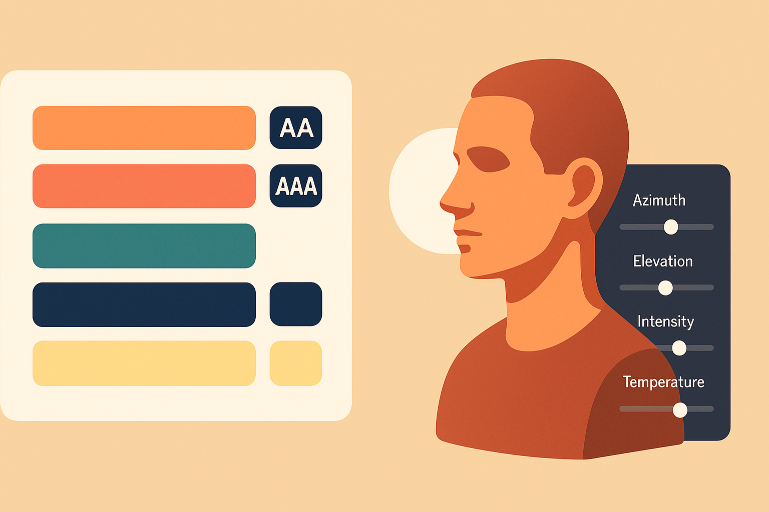
Color Workflows That Stick: Using Palette Vibe With Light Reference
A practical guide to turn color theory into repeatable lighting studies. Build accessible, on-brand palettes in Palette Vibe and test them on controlled scenes in Light Reference.
This blog is for artists who are serious about form and mood. We focus on lighting, readability, believable planes, and why your reference matters more than your brush settings. Every post is meant to be something you can actually apply in your next study session, not just “inspiration.”
We cover how to practice with controlled light, how to build believable depth without four hour render time, and how to use lighting style to tell story instead of just exposing detail. If your portraits keep looking flat or over-blended, you are in the right place.
A practical guide to turn color theory into repeatable lighting studies. Build accessible, on-brand palettes in Palette Vibe and test them on controlled scenes in Light Reference.
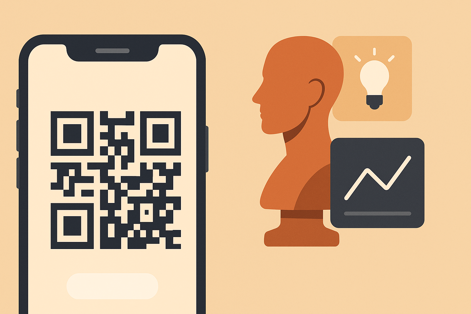
Turn your daily lighting studies into one-tap sessions with QR links. Create preset scenes, share study plans, track engagement, and jump straight into Light Reference from print or mobile.
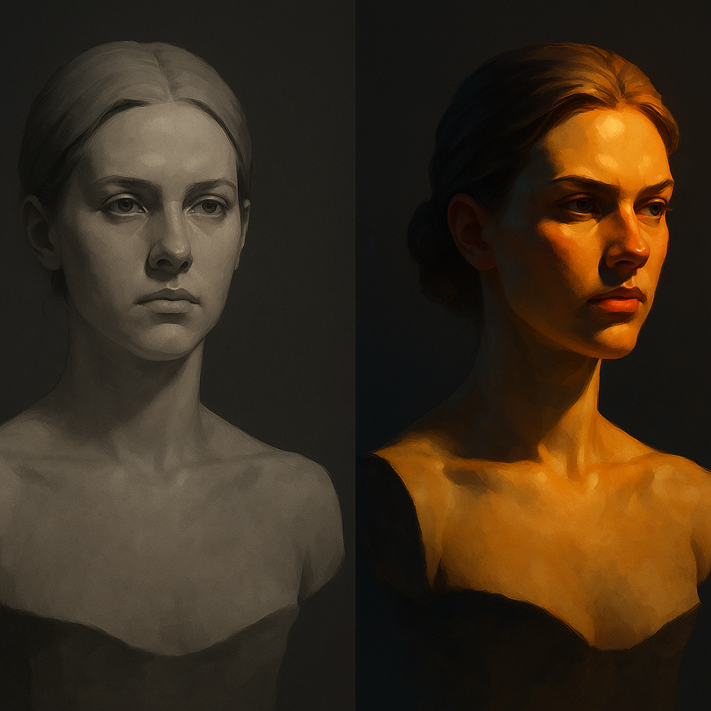
Lighting is not decoration. It is structure, mood, and focus. Learn why controlled lighting is what actually makes art feel professional and not flat.
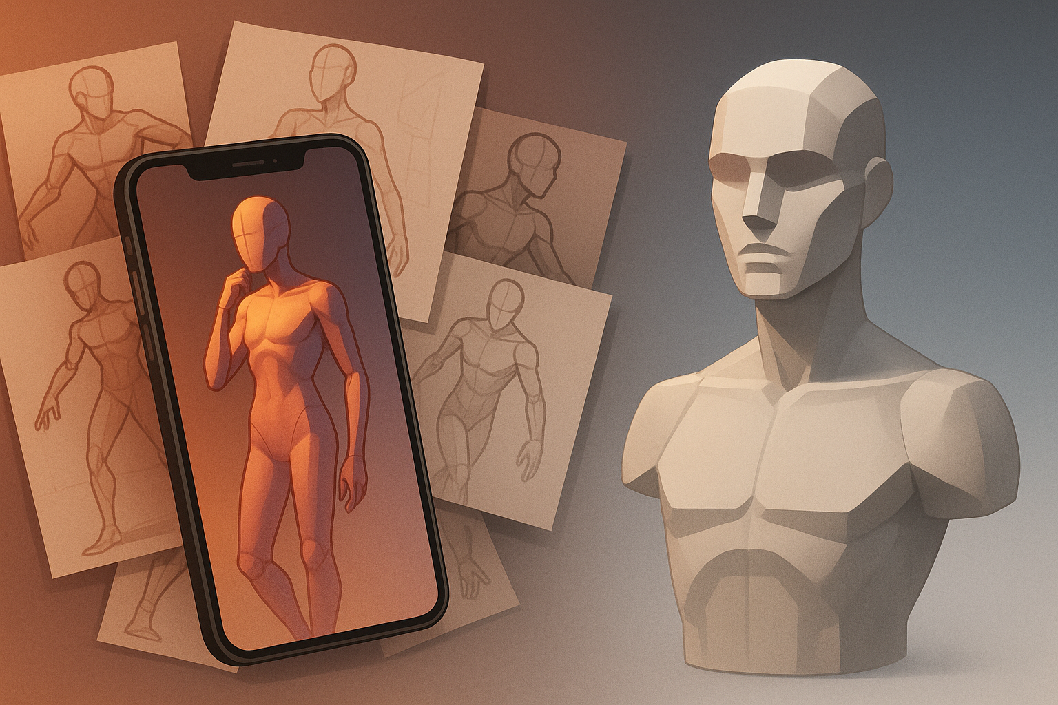
Pinterest feels useful for pose and face ideas, but it can quietly stunt your progress. Here is why and what a better study workflow looks like.
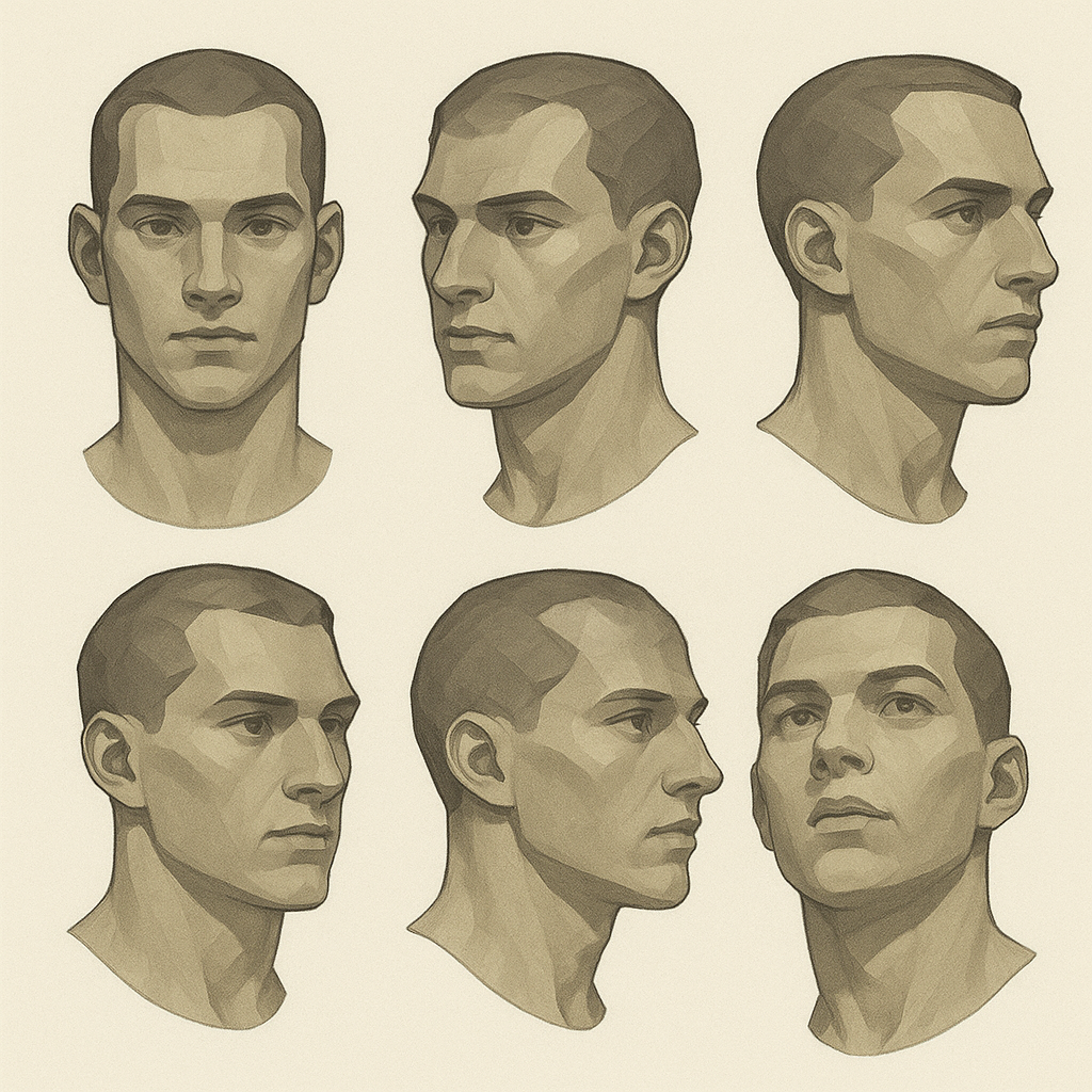
If you can only draw one flattering face angle, you will struggle with character work. Here is why controlled angle study builds real consistency.